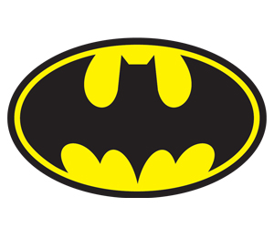
Preparing a logo presentation for a client we discussed the FedEX logo (for about the millionth time.) Suffice it to say that most of us here consider it a thing of beauty. That moment when your eye suddenly locks onto the white arrow formed by negative space is magical. The batman logo had the same effect on me…for the longest time I thought I was looking at something with its mouth open, then one day I looked and everything shifted. I saw the bat. “Ahhhhh!” Image found on logonoid.com
That’s the experience Lindon Leader, the creator of the FedEx logo, calls the “punch line” and it’s just great when you get it. I was interested in what Leader thought of his own creation so I did a bit of reading. Leader started by playing with two typefaces, the letter spacing, uppercase and lowercase. “I started squeezing the letter spacing, I saw a white arrow start to appear between the E and the x and thought, ‘There’s something there.’ I kept tweaking, and eventually not only did the arrow look natural and unforced, but I ended up with a whole new letterform.” Our design director Scott Eurich says, “He found it by accident and tweaked it on purpose.” That’s one reason why we never begin logo design on the computer but rather the good old fashioned way…by sketching. Pencil sketching is a very liberating exercise; your ideas flow without restriction and might take you places you hadn’t expected to go. Sketching is a very natural endeavor. The process itself encourages creativity. It’s only through sketching that the intentional and the organic come together, the overwrought and overthought can be discarded and simplicity and elegance emerge.
FedEx logo found on logodesignerblog.com.


Comments are closed.