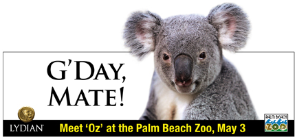
We’ve spent a lot of time on the road lately, visiting clients from Dania to Dunedin and from LAX to Glendale. (It’s only 20 minutes from LAX, but if you know anything about the Los Angeles freeway, it’s 20,000 miles in dog years). The theme of these rides is fairly predictable: for the first hour, you discuss the client and the project. Then you argue the benefits of Bagel Boyz vs. Brooklyn Bagel. You fiddle around with your iphone, listen to NPR until you lose the signal, fight over the air conditioning, and eventually get to the inevitable…the billboards along the way.
We are invariably struck by how few advertisers understand the medium. Surprisingly, this goes for national advertisers as much as local ones. (Do you hear us, Chase?) Not only are most billboards woefully unimaginative but in a world where the song “Make the Logo Bigger” shot to #1 on the ad agency charts, how do these clients not know that the type is too small?
As designers, we love small type. It’s elegant and artful (and of course, art directors like to minimize copywriter influence). But as marketers, we know that every medium has its own set of rules. Billboards are a great mass medium (though in my other life as a real person, I think the highways and byways of America would be prettier without them.) Yet advertisers use them as an afterthought, “ we have our multi-platform campaign, let’s just take it and make it a billboard, too. NOOOOOOO. The billboard requires an understanding of its unique power as medium. Believe it or not, mastering the medium is as simple as taking an everyday object and making it larger than life. One of the best was for Publix Supermarkets – a big white plain billboard with an empty refergrigerator on it. The only copy…Publix. What a way to send a message. A real refrigerator, precariously projecting off the front of the billboard, looming over the highway, telling you in a single image and word that when it’s time to shop, go to Publix.
Now that provides enough material for a roadtrip conversation to last awhile, all the way from “That’s cool, why didn’t we think of that?” to “Can you imagine if that thing fell off? That’s a lawsuit waiting to happen.” We weren’t quite as brave for our client, Lydian Private Bank who supports the non-profit Palm Beach Zoo, but we knew how to master the medium. We used a photo of the Zoo’s new Koala presiding over the road. There it was, 50 times larger than life and therefore, 50 time’s cuter and more engaging. It made an impression. Actually, it made thousands of impressions.


Comments are closed.