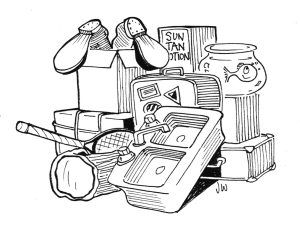
The easiest, most direct way to a logo that isn’t memorable or distinctive is to throw in everything but the kitchen sink. We had a City branding project not too long ago, part of which was logo design. The result of the design process was simple, elegant, memorable and unique. Unfortunately just about everyone in the City got involved, including one resident who memorably said “but we have dogs and ice cream too, where are those?” I’m infrequently rendered speechless, but perhaps, in this case, it was better that I was. Yet we’ve never had a logo design project where the client didn’t start out by saying “I want the Nike logo.” I presume they’re talking about the Nike logo after tens of millions had been spent marketing it. Prior to that, I can pretty much guarantee they would have said “what the hell is that and what does it have to do with athletic shoes?” Nevertheless, it doesn’t get simpler than that. And as Leonardo DaVinci said “Simplicity is the highest form of elegance.”
Call Us: +561 820 9196


Comments are closed.