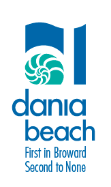
 The agency presented our brand recommendations to the CRA Board at City Hall last night.The purpose of the brand assignment was to support the City’s re-development and revitalization. It was essential that the new brand resonate with businesses investing in the City and residents who need to trust the City will follow through on its redevelopment promises. Our community meetings and insight generation sessions, as well as city-wide intercept interviews, showed that the City’s history was a perceived value asset and source of pride for many stakeholders. However, the previous positioning slogan “Broward’s First City” was weak on two important levels:
1) it did not express a brand promise and
2) because Dania had been in decline, the slogan carried a negative connotation: “just plain old.”
Based on findings, Wilesmith developed a brand promise, identity and design that supported the City’s “comeback” while reflecting its unique historic position in the County. The tagline First in Broward • Second to None honors the City’s significant history. At the same time, it moves the City forward with a promise that it will be nothing but the best. Not only is the brand statement a pride-builder, it’s also a strong geographic marker in the state of Florida, where the City’s primary marketing efforts will be focused. The logo is contemporary, structural and graphic, reflecting the City’s modern attitude. The use of the stylized nautilus as a frame of reference was inspired by the primary architectural design element used in the City’s new downtown center. The form is a perfect metaphor for the City, as the Nautilus grows in increasingly larger chambers throughout its life making it a symbol for expansion and renewal. It reinforces the City’s new image and creates consistency between environmental graphics of the new plaza and the new brand design. The wave formation at the top references the City’s substantial maritime assets, while the vertical form on the right references its new ascendancy. The logo utilizes the negative space to form the letter D (the City is commonly referred to as ‘Dania’), which serves as the locus for the other graphic elements of the logo. The master logo extends perfectly through the use of color to sub-brand various City districts, again creating harmony, uniformity, consistency and image reinforcement.

Comments are closed.